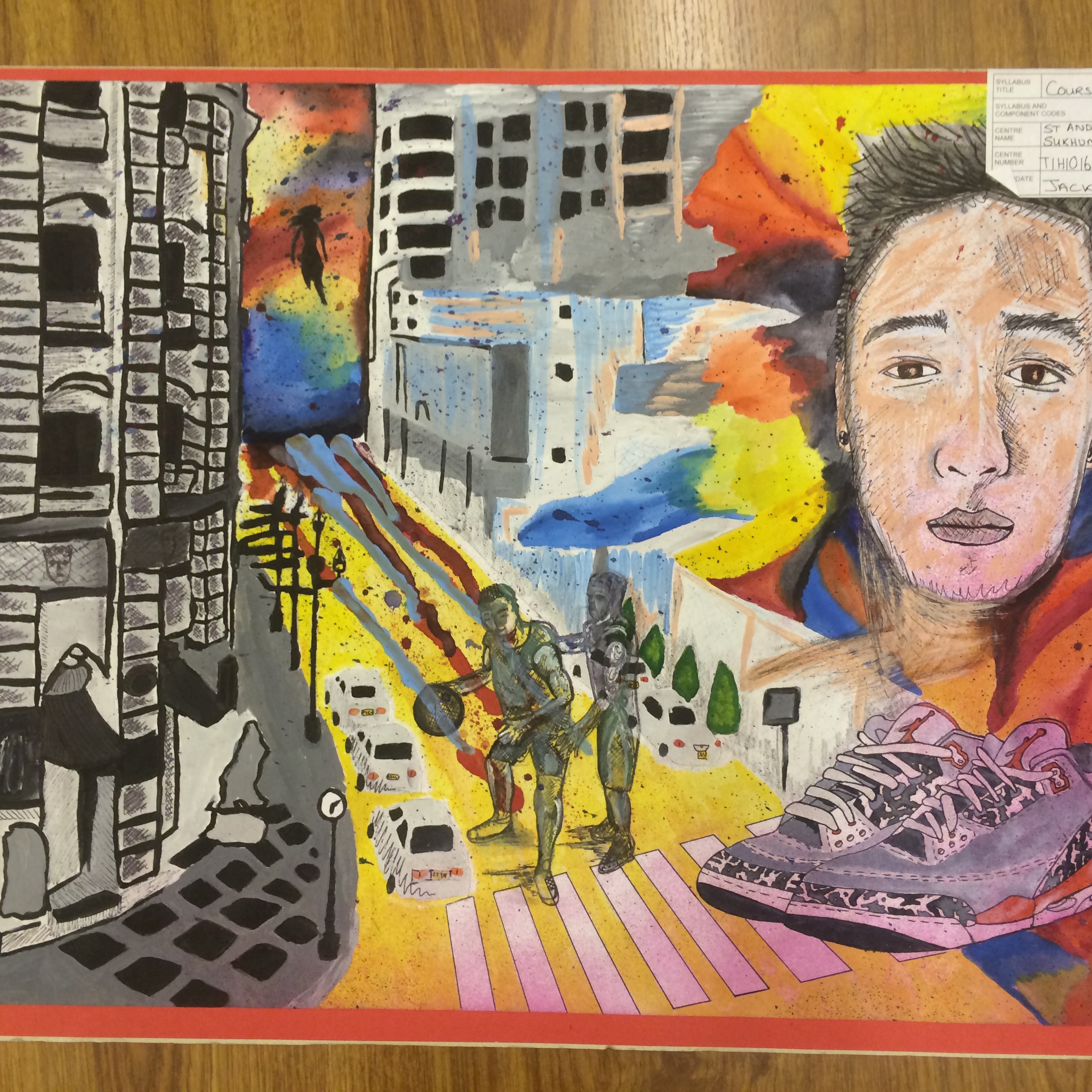
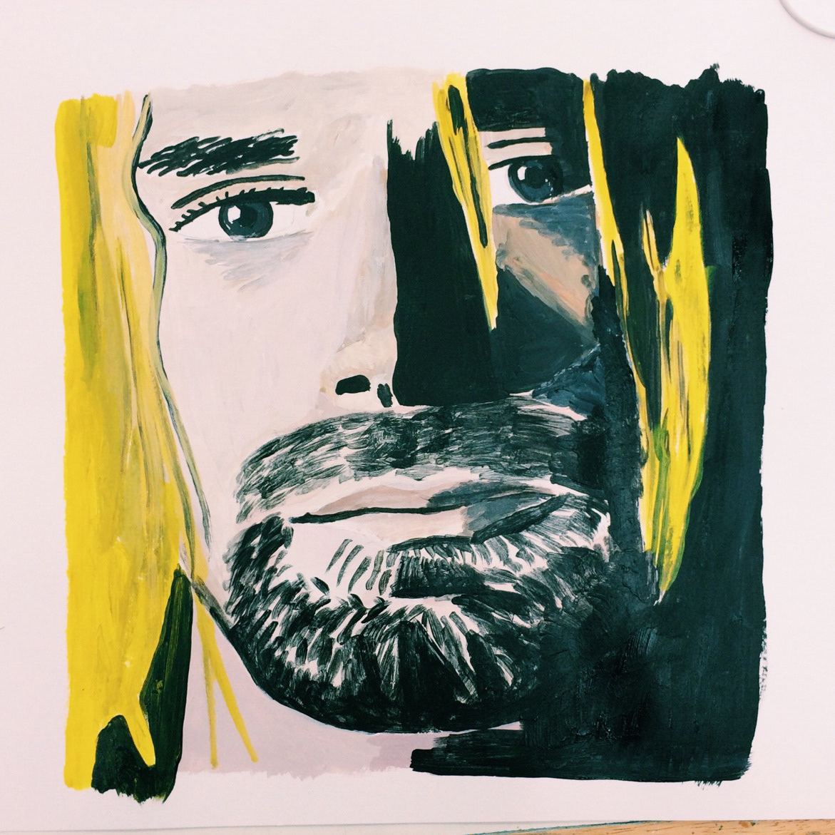
Following my project based around portraiture, which was centred around identity and how a subject is represented, I started this project with a similar approach. Emotion and feeling is still a prominent theme although it is displayed by both the body language and facial/stylistic features used in my portraits.
Facial expressions in portraits can communicate a lot to the viewer, however the stance and pose of the figure gives a more direct, spontaneous, subconscious impression of the subjects current emotional state - the same impressions we use on a day-to-day basis to intuitively guess what someone may be feeling.

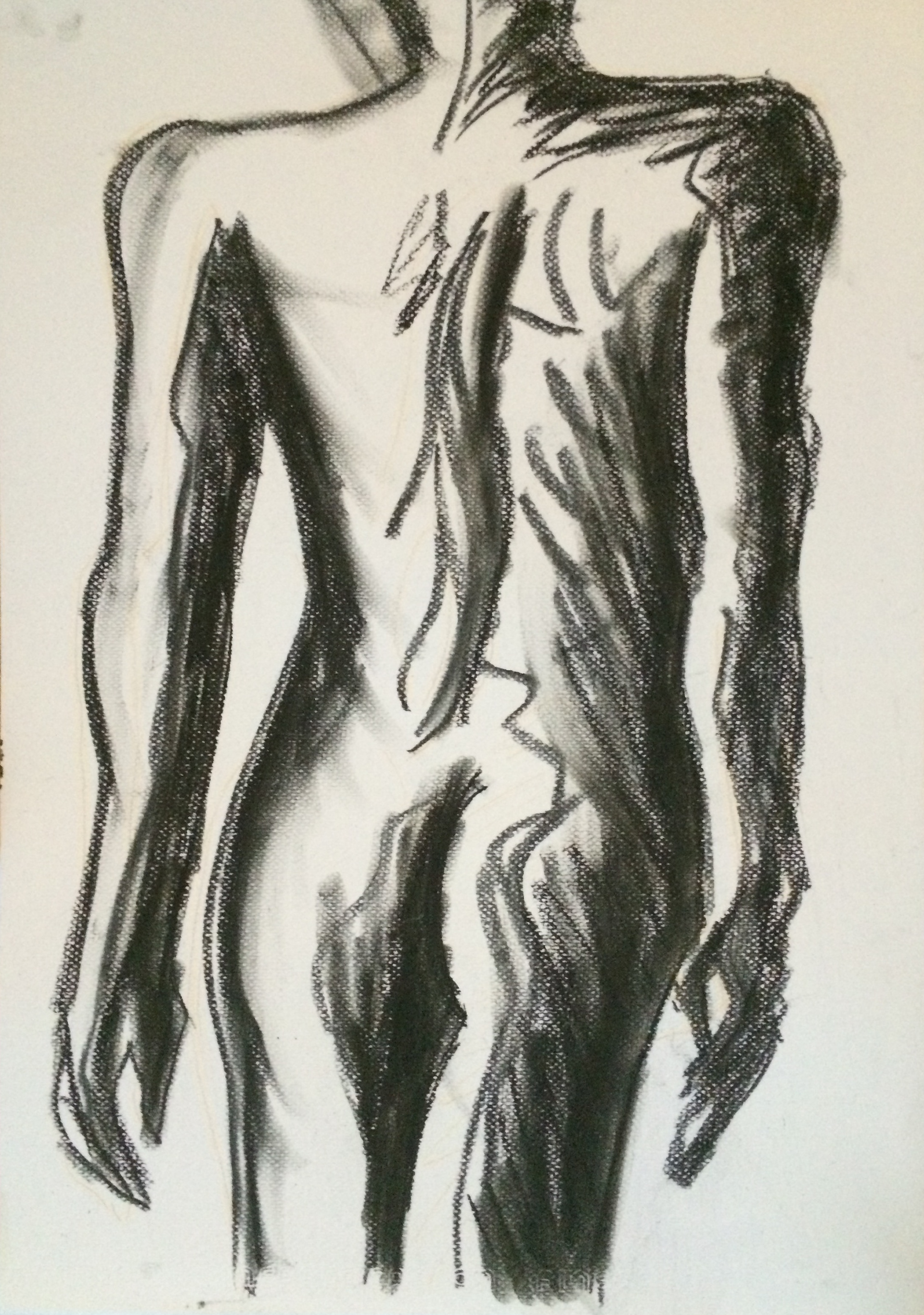
Charcoal study of body contours and shadows. Contrast of black white and charcoal darkness creates negative space and variation in light.

Experimenting with distorting 2 faces to create the impression of them merging together to make 1, pencil (left) developed into pen (right) - inspired by Edvard Munch's "The Kiss" series of artworks (see sketchbook page with reproduction of his painting below)

Sketchbook page with an acrylic reproduction of Munch's kiss - using colour harmony of pinks, reds and blacks.
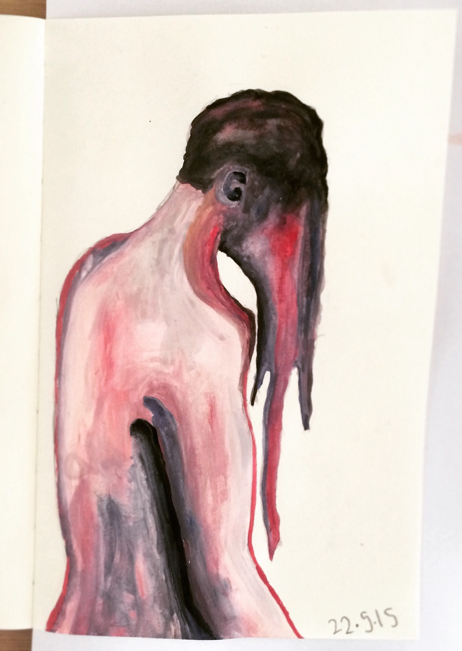
Abstract watercolour experiment - melting face. Smooth blending of watercolour going in one direction creates an effect of free flowing water, along with harmonious combination of pinks, reds, and purples.
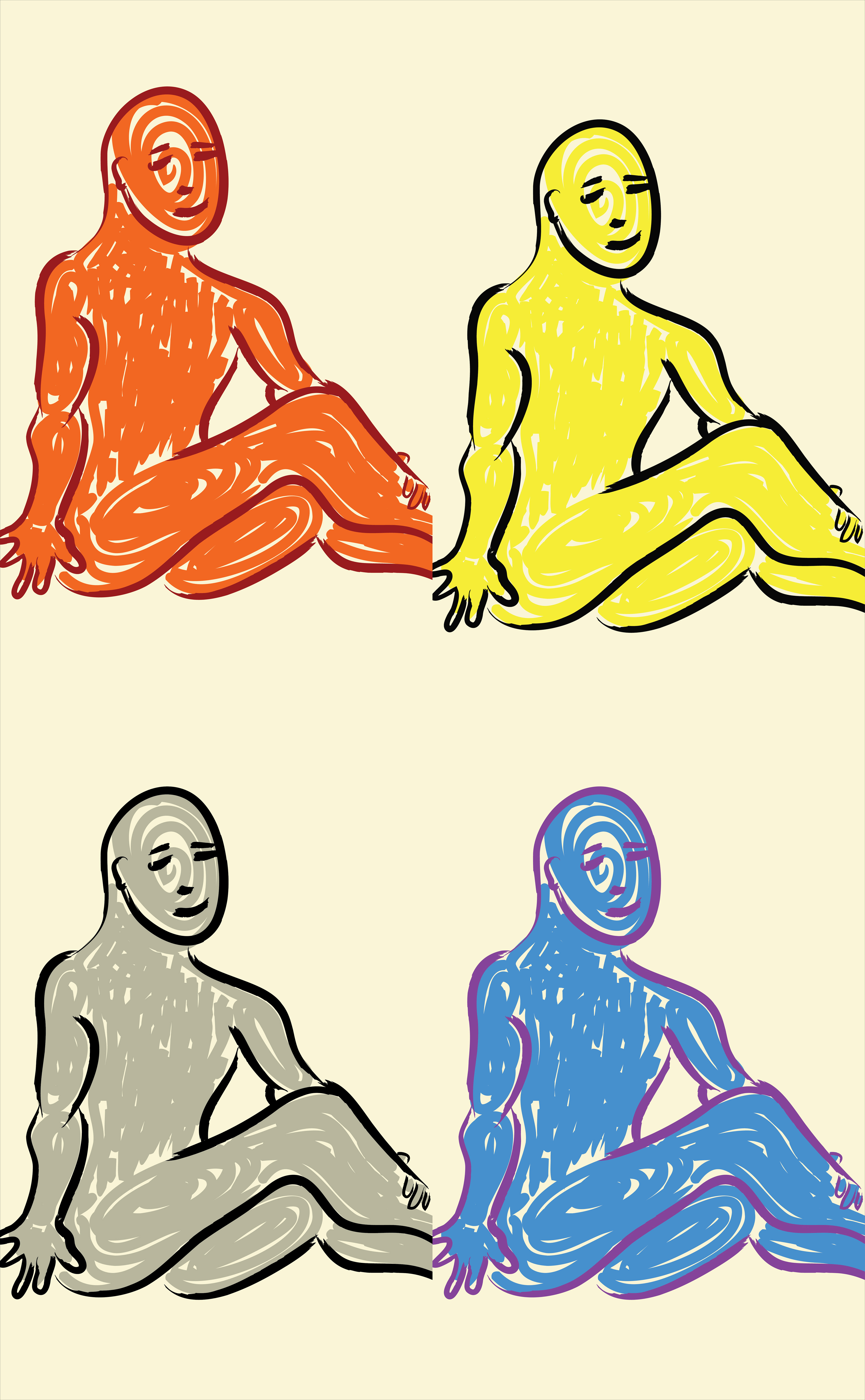
"The Duality of Opposites of Emotions" - I was inspired by both Andy Warhol's 2x2 grid arrangements for his pop art and Henri Matisse's minimal figurative sketches to create this piece, to show the duality/juxtapositions of emotions in human existence; represented in the contrasting colours used to represent the different emotions of the same subject.
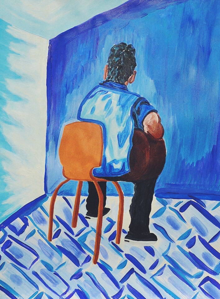
Study of "blue" guitarist in room - Experimenting with harmonic colour combinations of different tints of blue and decorative styles of painting, inspired by Henri Matisse
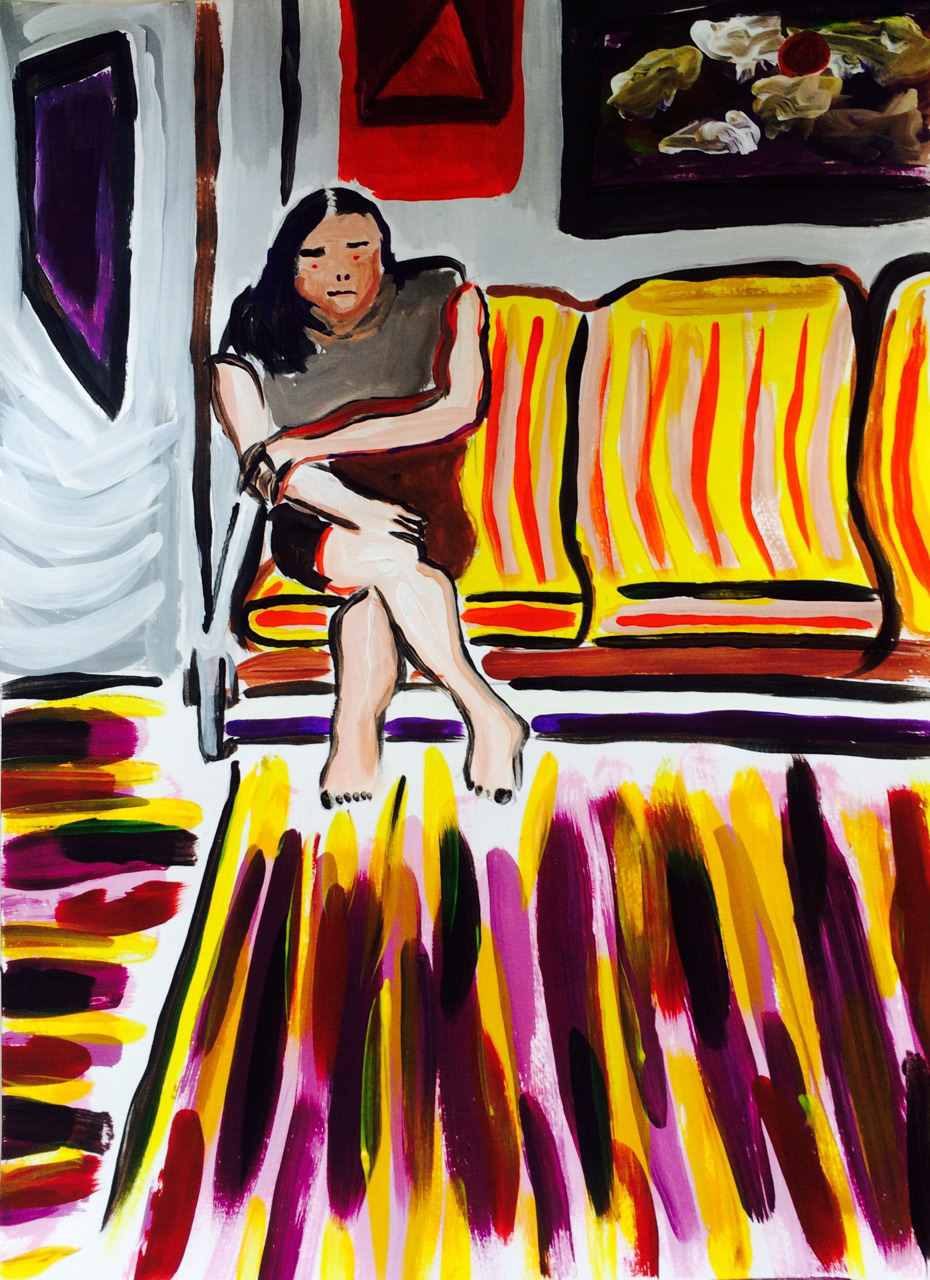
Abstract woman riding the train - acrylic. I used vibrant, bright colours to create contrast and energy in the picture
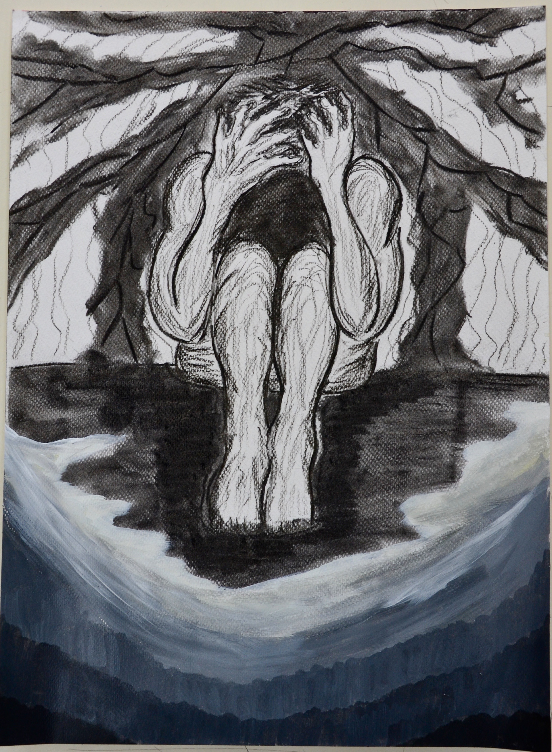
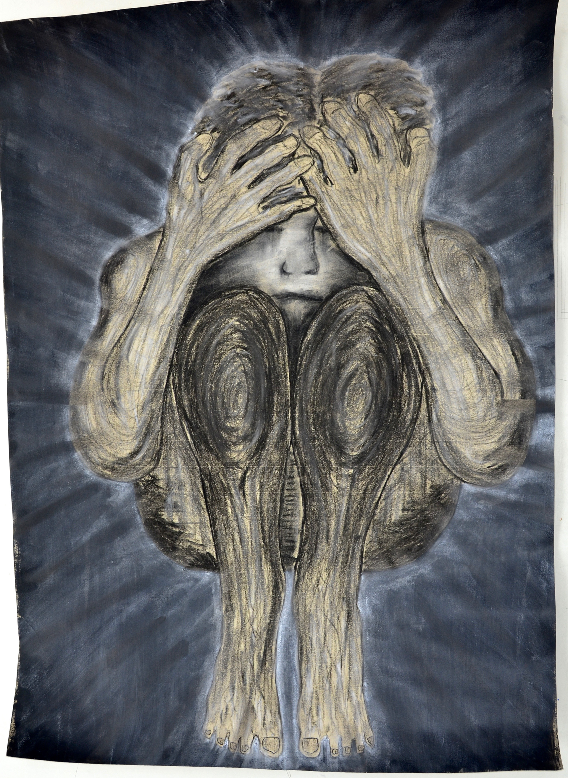
Development for 'Despondency'
“Despondency” - chalk/charcoal/acrylic on paper. Variation of line direction guides viewers to different parts of the body, and to the edge of the piece too by the background lines. The slight use of white/grey juxtaposes the dominant use of black, which represents the dominant feeling.

"You and I" - pallette knife oil painting, experimenting with abstract use of colour and application to build up textures and tone of the human body
Motif developed from "You and I" above
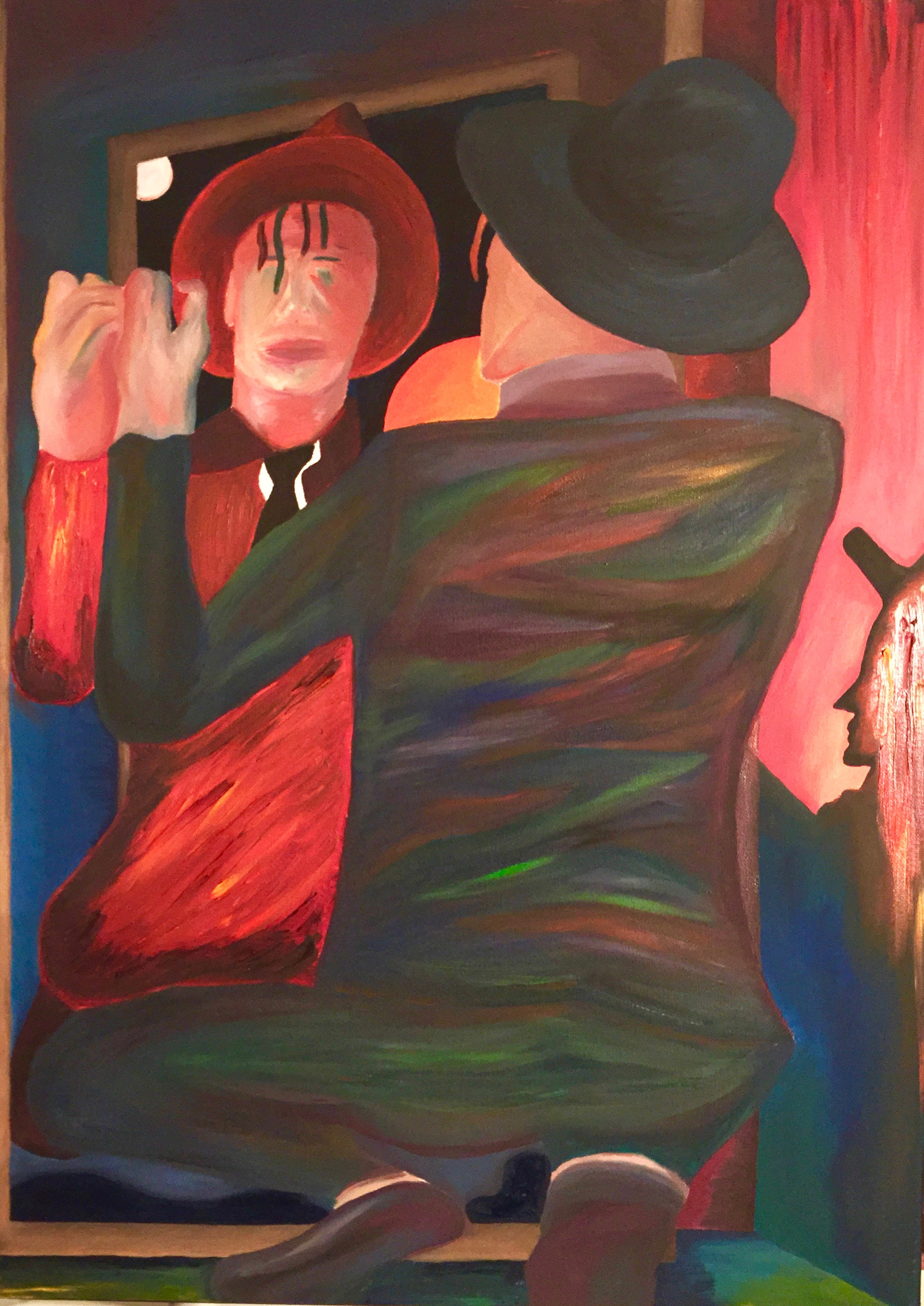
Portrait of David Bowie - oil on canvas
This piece intends to show that the reflection you see of yourself isn’t always the reality of who you are - your true self has many more colours than the one-sided representation of your reflection.
Lastly, the shadow complex of the personality is the negative parts of your self that you see in others but deny possessing yourself.
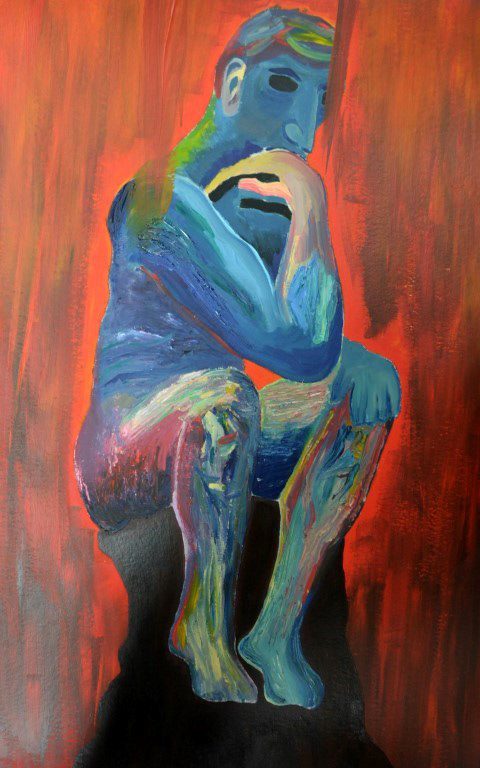
“The Thinker”
I wanted to express the multiple feelings possible from ‘thought’ itself, thus the ambiguity of the colour scheme. This is my rendition of Auguste Rodin's famous statue.